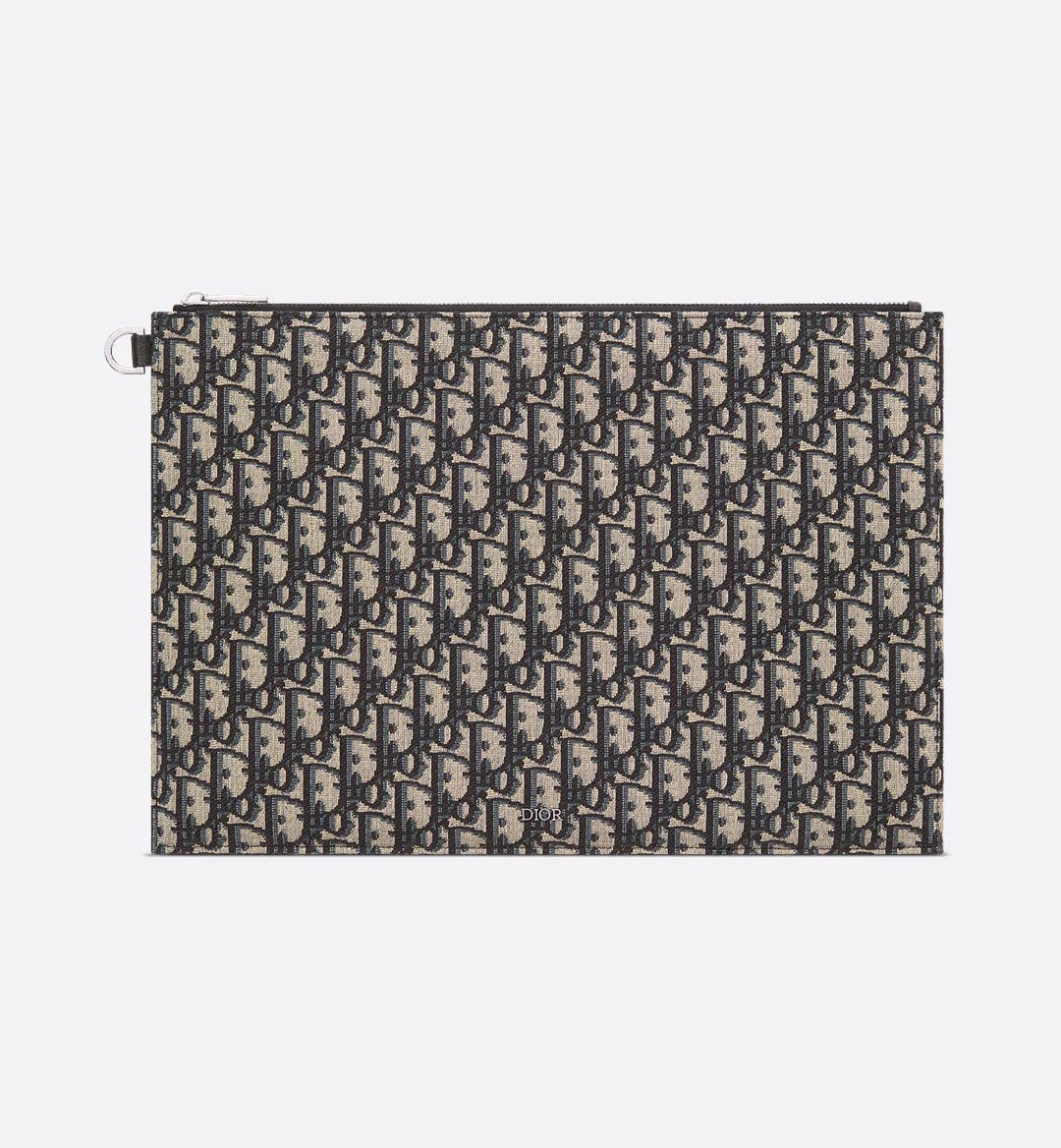
“A monogram’s success is attributed to several factors. First, the most recognizable ones are ones that are memorable and visually pleasing. Design elements like colorways, typography and sizing are the key to turning a logo into an iconic monogram”.
Sean Conway, Sneakers and Streetwear Expert for The RealReal
When a design becomes more than just a successful creation is where identity, vision and visuals get entangled to define the laws of what it means to be classic.
Every brand has is own traits. You know, every brand can be associated with a specific color, font and ultimately expectations purely based on the design behind its own logo and ads campaigns.
Visuals are powerful, and brands know it better than anyone else. It's marketing, baby. That's a reason why Coca Cola logo is red and Milka is purple: one wants to evoke power and security, the other pushes on creativity.
And the same goes for fashion brands. Dior, Gucci, Chanel and many others wisely use colors to make clear, in a subconscious way, where they want to place themselves according to their values and target audience.
But fashion brands can even make a further step: creating recurrent patterns and textures with which clients can identify them with. This is where a brand becomes more than just a brand. This is where a brand find its way to stick in the mind of people.
But a well made logo can do the same, you may think. Well, yes…but actually no. A pattern or a texture can go even further than what a logo can do: it's not meant to show off (like a logo is) but to quietly remind you the story of what you're carrying.
The Iconic Patterns series does exactly that: telling the stories behind the most iconic patterns in fashion history.
•
•
•
* This post does not contain affiliate products.
First things first: the brand and its origins
Despite being born in a wealthy family, Christian Dior's rise to success was not free from pain. Second of five children, born in 1905 in Granville (France) he had to face the death of both the mother and one of the brothers when he was still very young. Moreover, his parents wanted him to become a diplomat, despite his open interest in arts. That's why he enrolled at the prestigious École des Sciences Politiques to undertake an education in political science in 1925.
But he didn't set aside his dream, his ambition is what drove him to the way to success. In 1928 Dior opened a an art gallery with his friend Jacques Bonjean, where they hosted works of acclaimed artists such as Picasso, Dali, Braque and Matisse, just to name a few. In 1932, Christian opened another gallery with Pierre Colle.
Three years later he began making profits through his drawings, selling them to milliners and couture houses. At the same time he also managed to work as a fashion illustrator for newspapers and magazines like Le Figaro and Jardin des Modes.
Other two important milestones that paved the way to Dior's successful career have been the possibility to work with Robert Piguet and Lucien Lelong as a house designer respectively in 1938 and 1941.
Christian Dior founded his own fashion house in 1946, as soon as he left the job with Lelong.
Dior Oblique
In the first episode of the series, we will dive into the history of the most famous Dior pattern: Dior Oblique.

The Dior Oblique pattern was designed in 1967 by Marc Bohan and made its official debut in 1969, on the runway of the S/S collection, featured primarily on accessories and luggage.
Bohan is known as the longest serving creative director ever of the Dior fashion house (from 1961 to 1989) and the one that definitely raised its standards, making it the empire we know today. Taking inspiration from typography, Bohan wanted to create a pattern that featured the letters composing the word Dior in a repeated and regular sequence. The result should have been elegant but modern at the same time, a visual and synthetic reflection of Dior's aesthetic.
Keep reading with a 7-day free trial
Subscribe to FROM 2 TO THRIFT to keep reading this post and get 7 days of free access to the full post archives.


